# SQL Based Visualization
# I. Overview of Visualization Module
Visualization module is a functional module developed to provide richer data presentation and more intuitive data analysis capability.
You can enable flexible and efficient exploratory analysis by dragging and dropping fields. Based on the needs of actual scene, various fine-grained configurations can be made for chart types and styles to achieve highly customized chart construction.
The visualization module only applies to SQL reports .
# II. Introduction to the Concept and Process
# 2.1 Basic Concept
Report composition:
A report consists of " **result data **" and " **visual chart **". If a chart is added, the configuration of both parts is saved/updated when the report is saved/updated .
For SQL query results, only one chart is currently supported, and it is allowed to be saved as a report without adding visual charts.
**Visual data source **: The data source of the visual chart is the first **1000 pieces of **data in the SQL query results. When you enter the visual configuration page, the data will be recalculated according to the query conditions, and there may be cases where the results of the SQL page are not exactly consistent.
# 2.2 Operation Process
The basic process for creating a SQL report is as follows:
- New query → 2. Add Chart → 3. Configuration Chart → 4. Save chart configuration → 5. Save Report.
The report only supports adding up to one chart and allows saving as if no chart was added. The report can add charts (when not added), modify data sources, modify chart configuration, remove charts and other operations.
# 2.2.1 New Query
Enter the SQL statement and calculate.
# 2.2.2 Add Charts
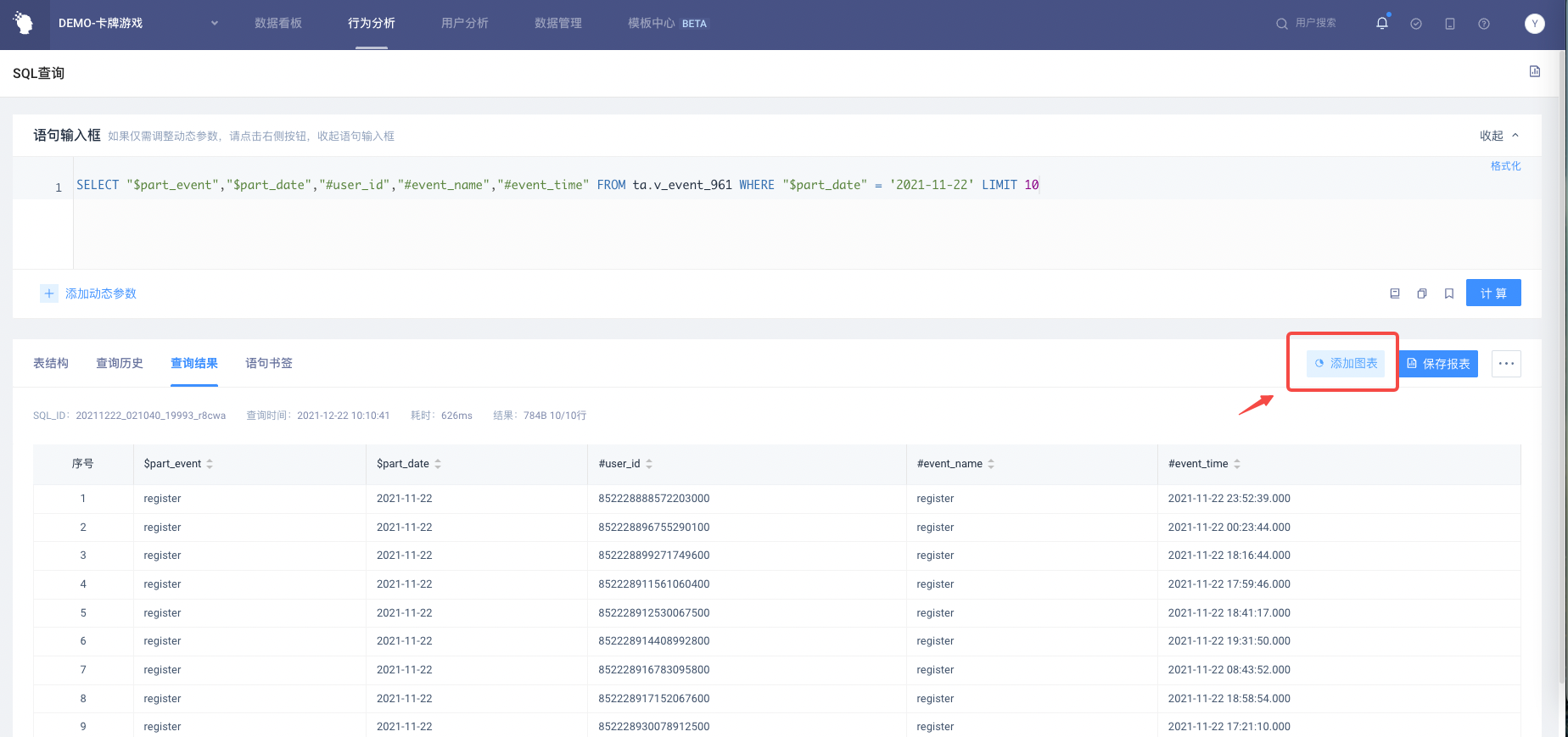
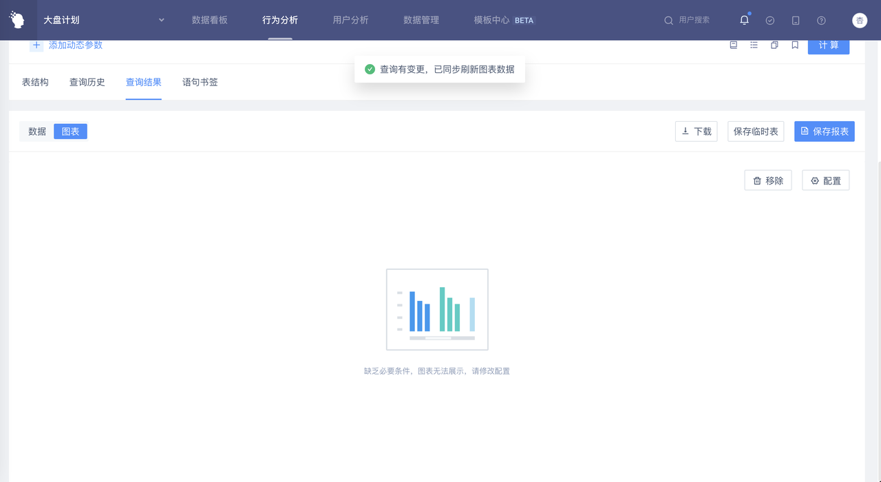
When the SQL query has results and no chart is added, click 'Add Chart' in the upper right corner to enter the visual configuration page. You will not be able to enter the configuration page when querying for no result data..
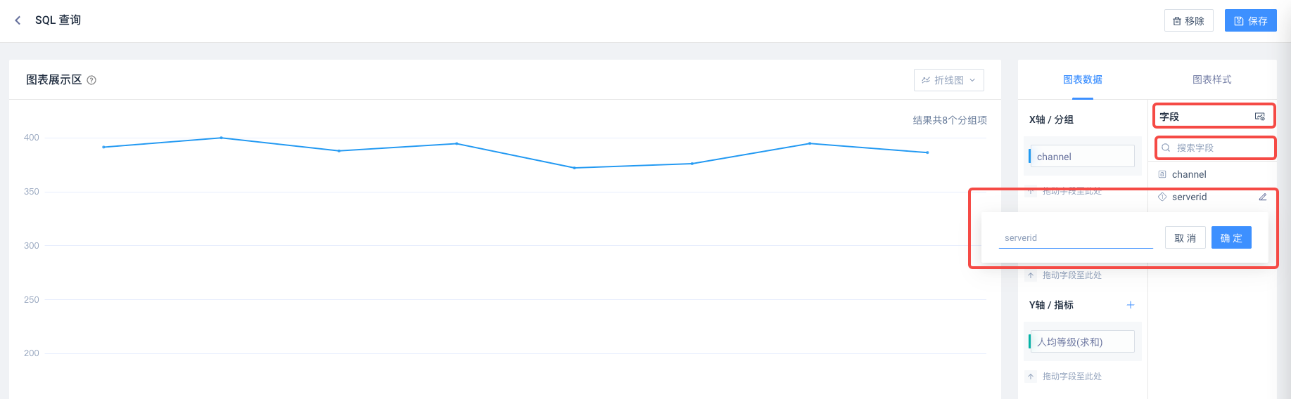
# 2.2.3 Configuration Chart
The operation on the visual page includes the configuration of chart data, chart style, and chart type. The specific operation method will be described in detail in Chapter 3 " Visual Configuration "
# Initial Configuration Status
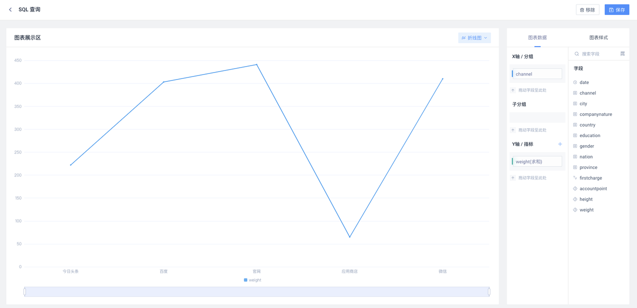
Enter the visualization page when the chart is not added, and the default display is the initialization state: the first numeric type field in the result field is filled in with the index item, and the first non-numeric type field is filled in with the grouping item, which is displayed as a line chart.
When the number of query result fields is insufficient, fill in the upper limit number. The lack of numeric fields will lead to abnormal chart display. In abnormal conditions, you can adjust the configuration to make the chart display normally.
# 2.2.4 Save Chart Configuration
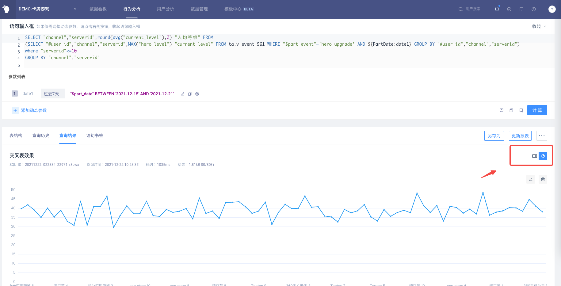
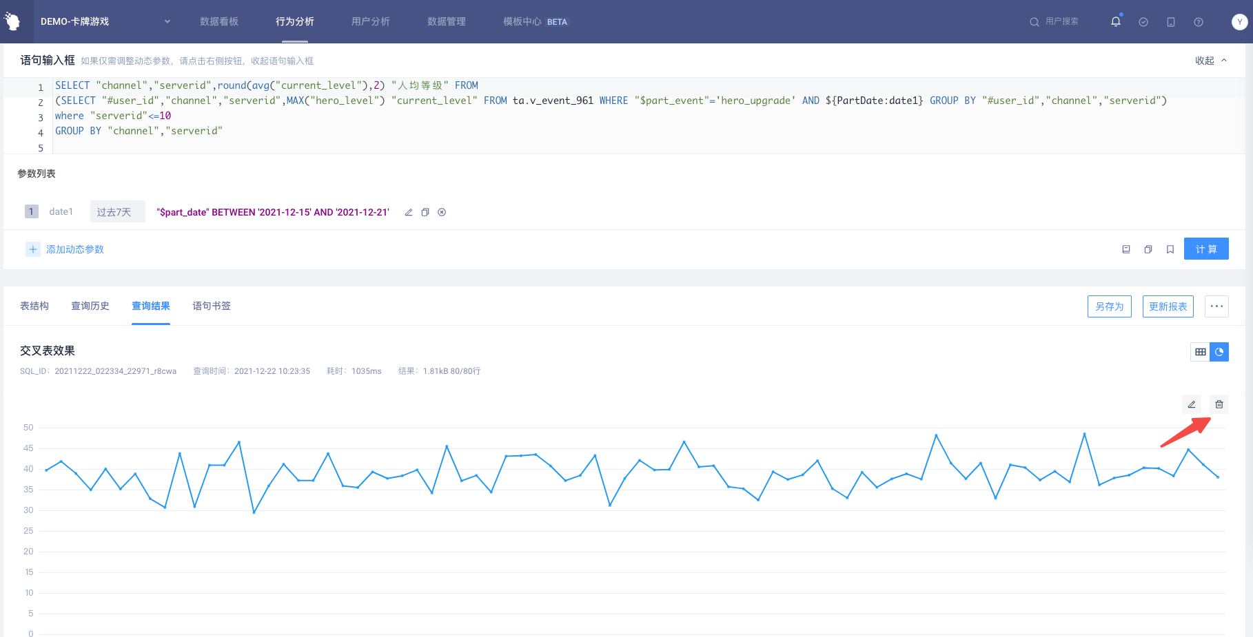
After the chart is configured, click the 'Save' button in the upper right corner to add the chart configuration to the SQL result page, where you can switch to view the result data or chart :
# 2.2.5 Save Report
Click 'Save Report' when the chart has been added, and it will be saved together with the chart. If the chart is displayed in an abnormal state due to changing the data source, the chart will be automatically removed when saving the report, and only the data result table will be saved
- If the 'Save Report' operation is not performed after adding the chart, the chart configuration will be cleared when leaving the report page.
# III. Visual Configuration
# 3.1 Configuration Page Structure
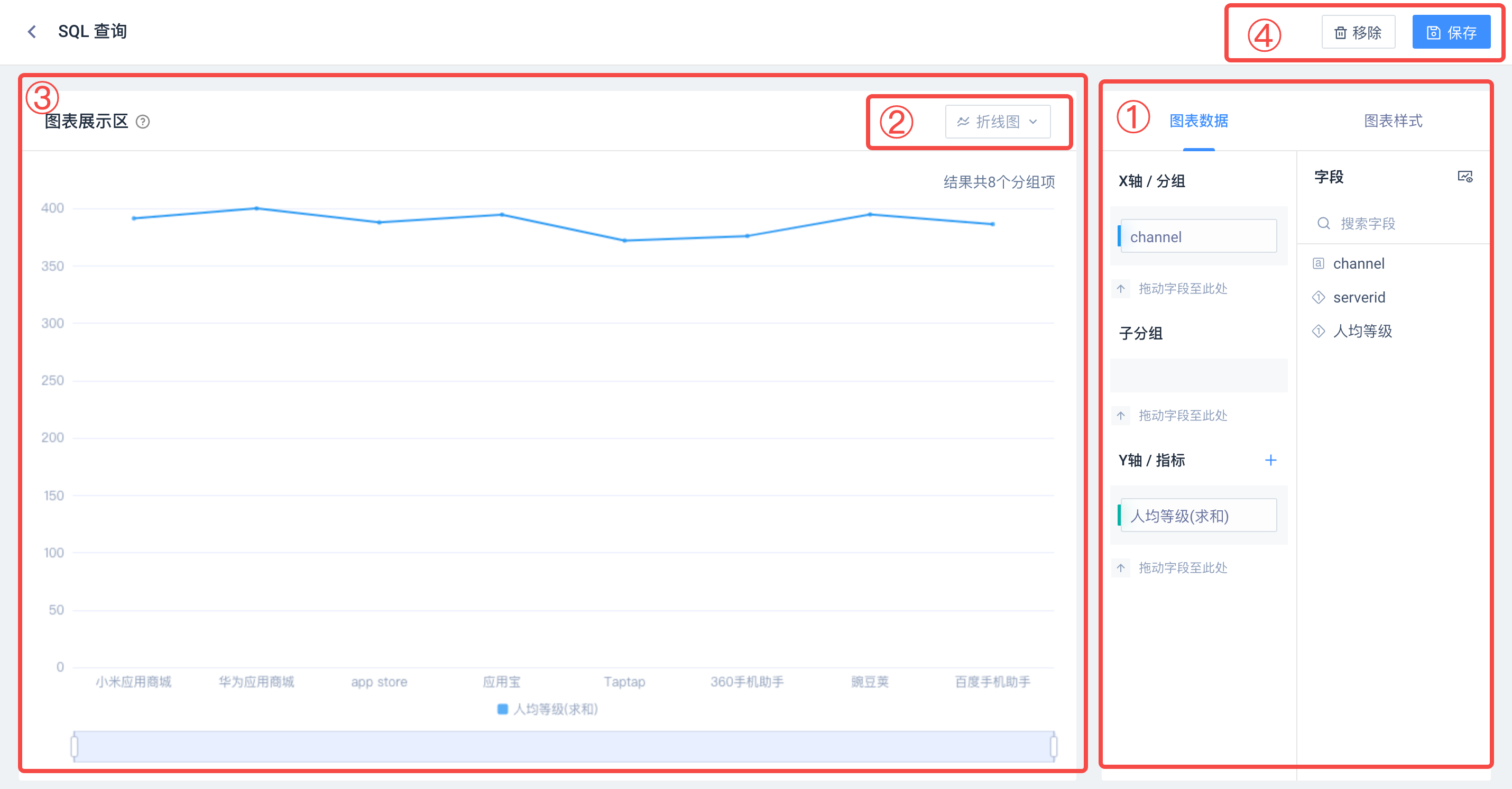
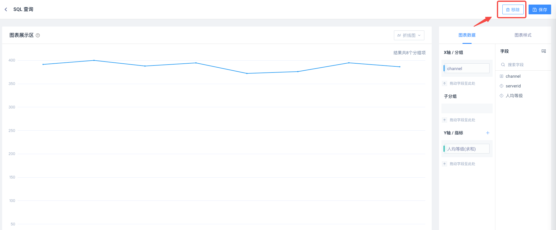
# 1) Chart Configuration Area
There are two tabs under it. 'Chart Data' can configure the fields that need to be displayed in the chart, and 'Chart Style' defines the style details.
# 2) Chart Type Selection
Switch chart types, supported chart types are: line graphs, column graphs, stacked column graphs, combination graphs, circle graphs, one-dimensional tables , cross tables.
# 3) Chart Display Area
Show the final effect of the chart, and respond immediately to the operation of the configuration area.
# 4) Basic Functional Areas
Return to SQL page and save/remove chart.
# 3.2 Chart Construction
Drag and drop to add the right field to the data configuration area to build the chart, and drag and drop to delete the field is also supported.
When the added fields meet the basic conditions for building the chart, the chart display area will be displayed. Any configuration of the chart, the display area will instantly refresh the chart effect.
When no chart is added, the visualization page is displayed as initialization by default: the first numeric type field in the result field is filled in with the indicator item, and the first non-numeric type field is filled in with the grouping item to be displayed as a line chart.
# 3.2.1 Fields List
On the right side of the Data Configuration tab are all fields in the SQL query results. You can distinguish the field types by the identification before the field:
Field support search and set display name, click the icon in the upper right corner to quickly view the SQL result data.
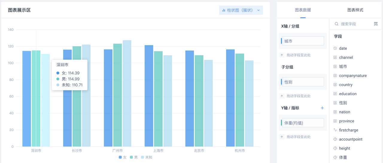
# 3.2.2 Data Configuration
Chart data configuration items are divided into three areas: group, sub-group and indicator. Configuring sub-group is not supported on some charts or scenarios.
- [Group]
Usually, non-numerical fields are used to classify and display data. Allows you to drag in multiple fields that are merged into one grouping item in the chart.
- [Sub-group]
It is usually served by non-numeric class fields, which are used to further drill down the subdivision category, allowing multiple fields to be dragged in, and multiple fields will be displayed together.
Combination graphs, cluster bar graphs (multi-indicator scenarios), loop graphs, and one-dimensional tables do not support setting subgroups.
- [Indicator]
Usually, numerical fields display index values. Allow dragging into multiple fields.
[Group] and [Subgroup] allow numerical fields to be filled in, and the values of this field will be grouped at this time. [Indicator] also allows fields other than numerical values to be filled in. At this time, the field will be aggregated by default in a 'counting' manner.
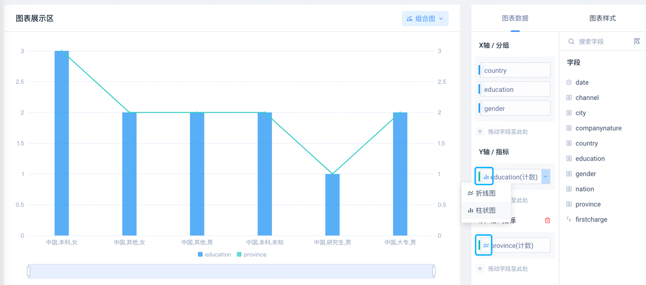
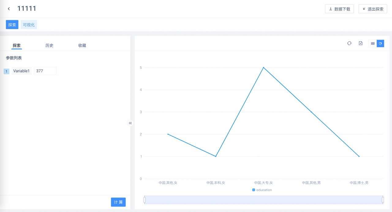
Taking the vertical coordinate system chart (single indicator scenario) as an example, the difference between [group] and [subgroup] can be simply understood as that the group represents the X-axis node, and the subgroup represents the legend, as shown in the following figure:
# 3.2.3 Two-axis Configuration
Chart types that support biaxes: line graphs, bar graphs (cluster), stacked bar graphs, combined graphs.
Click '+' on the right side of [Y axis/indicator] to increase the secondary Y axis. Drag the field into the secondary axis to achieve a bi-axial effect. If you want to adjust the axis of the indicator, you can adjust the position of the field or set the slave axis of the indicator in 'Chart Style'.
When the minor axis is deleted or switched to a chart that does not support two axes, the indicators on the minor axis will be automatically incorporated into the main axis. * When there is an upper limit on the number of indicators allowed in the target chart, some indicators will be discarded.
# 3.3 Data Field Configuration
# 3.3.1 Sort
- [Group] field
Sorting the grouping items themselves, supporting multi-grouping nested sorting
- [Indicator] Field
Sort all groups by indicator value. Only one indicator is allowed to be sorted at most, and the sorting of other indicators will be automatically cleared when sorting a certain indicator.
When sorting [Group], the sorting of [Indicator] will be automatically cleared, and vice versa; switching chart types will clear all previous sorting.
# 3.3.2 Aggregate Computing
- [Group]/[Subgroup] field
Support counting (default), deduplicate counting.
- [Indicator] Field
Support summation (default), mean, counting, deduplicate counting, maximum value, minimum value.
When fields of non-numeric type are added to Indicator, the aggregate calculation is counted by default.
# 3.3.3 Data Display Format
The default format is two decimal places with the thousandth digit enabled. You can customize the decimal places, percentage digits, quantity unit and whether to enable the thousandth digit.
A maximum of 10 digits are allowed after the decimal point. If the end of the decimal is zero, it will not be displayed.
# 3.3.4 Graphical Marking
Only a combination chart is supported. You can customize the graphic style of indicators on the primary / secondary axis: Line chart or bar chart。
# 3.4 Chart Style Configuration
The configuration items supported by different chart types are different, as follows:
| X-axis number of groupings/number of sub-groupings | X-axis display axis label | X axis label spacing | X-axis label text | Y axis/sub Y axis display axis label | Y-axis/sub-Y-axis interval | Indicator selection | Indicator slave axis | Display digital labels | Show maximum value | Display color level | Show week | |
|---|---|---|---|---|---|---|---|---|---|---|---|---|
| Line graphs | ✅ | ✅ | ✅ | ✅ | ✅ | ✅ | ✅ | ✅ | ✅ | ✅ | - | ✅ |
| Column (cluster) | ✅ | ✅ | ✅ | ✅ | ✅ | ✅ | ✅ | ✅ | ✅ | ✅ | - | ✅ |
| Stacked column diagram | ✅ | ✅ | ✅ | ✅ | ✅ | ✅ | ✅ | ✅ | ✅ | ✅ | - | ✅ |
| Loop map | ✅ | - | - | - | - | - | - | - | ✅ * Note 1 | - | - | ✅ |
| Combination diagram | ✅ | ✅ | ✅ | ✅ | ✅ | ✅ | ✅ | ✅ | ✅ | ✅ | - | ✅ |
| One-dimensional table | ✅ * Note 2 | - | - | - | - | - | - | - | - | - | ✅ | ✅ |
| Crossover table | ✅ | - | - | - | - | - | - | - | - | - | ✅ | ✅ |
Note 1: Loop numbers contain grouping item names and percentages.
Note 2: One-dimensional table is displayed as 'number of rows', default 1000, upper limit 1000
- X-axis number of groupings/number of sub-groupings.
The number of groups in the X axis controls the number of group items displayed, that is, the number of nodes on the X axis, the default is 50, and the upper limit is 1000; the number of sub-groups controls the number of sub-group items displayed, the default is 5, and the upper limit is 50.
Loop default 5 + 1 (1 is 'other'), the upper limit is 10 + 1; One-dimensional table is displayed as 'number of rows', default 1000, upper limit 1000.
- X axis tag, axis tag spacing, tag text
Controls whether the label of the grouped item on the X axis is displayed, the number of display intervals, and the interception rules of the label text.
- Y axis/sub Y axis display axis tag, axis interval
Control whether the Y-axis/sub-Y-axis label is displayed and the range of the axis interval.
- Indicator selection, indicator subordinate axis, display number tag
Subordinate axis can be set for each indicator, and whether to display digital tags. The settings of different indicators can be displayed on the chart at the same time.
- Show maximum value
The maximum and minimum values of a single indicator can be highlighted.
- Display color level
Divide the value interval of each indicator into 12 color levels. The larger the value, the darker the color.
- Show weeks
Valid only for date format data, marking the week after the data.
# 3.5 Switch Chart Type
V3.5 version offers seven chart types: line graphs, bar graphs, stacked bar graphs, loop graphs, combination graphs, one-dimensional tables, cross-tab chart, which can be switched by the chart type switch button.
When switching chart types, the chart field configuration, axis style, and indicator style under the previous chart type will be retained as much as possible. If the configuration supported by the chart type before and after switching is different, the system will automatically adjust, which may cause data configuration changes or some fields are removed.
For example, a bar diagram with subgroups is switched to a combination diagram. Since the combination diagram does not support subgroups, the fields of subgroups will be automatically transferred to the groups.
# IV. Update Charts
Charts that have been added to the SQL page are allowed to be updated in two cases:
- The data source remains unchanged, reconfigure the chart
You can re-enter the visualization page through 'Configuration' in the upper right corner of the chart. After saving the operation, the new configuration will overwrite the original configuration
- Change the data source
Modify the SQL statement recalculation (including viewing historical queries), will automatically refresh the chart according to the new data source, such as the new and old data sources have the same chart fields . The chart will try to retain the field configuration, otherwise the chart will be displayed as an abnormal state, you can 'Remove' the chart, or enter the visualization page again to reconfigure.
# V. Remove Charts
Two ways:
- On the SQL results page, you can edit and remove visual charts below the chart view.
- Go to the visualization page and click 'Remove' in the upper right corner of the page.
- For saved reports, the removal of the chart will take effect directly without clicking 'Update Report'.
# VI. Dashboard Display
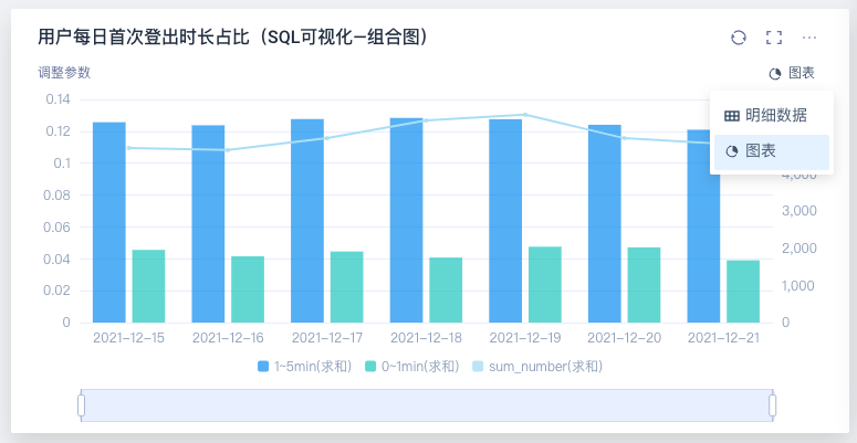
SQL reports that have added charts will be displayed as charts by default in dashboard. You can temporarily switch to detailed data on dashboard, or set it as detailed data in dashboard 'Report Settings'.
# VII. Exploration Module
The exploration module can be used for visual exploration based on report data, and the functions are exactly the same as those in the visualization page.
# VIII. Best Applications
# 8.1 Biaxial diagram
When you want to display two indicators (such as values and percentages) with large magnitude differences or different number formats in the same chart, you can add sub-axes and set different indicators on different vertical axes to achieve a reasonable display effect; You can also use combination charts to achieve the same effect, or even set different indicators as different graphs (such as polylines or columns) to better distinguish them.